


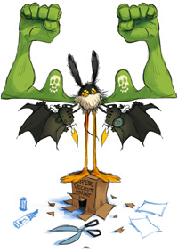
Alright, here are two rough Motorbirds design blueprints but only one is needed for a t-shirt which will be available at TeeBlitz within a short time. Unfortunately, I've not the time to clean-up both of them, so please help me to pick the right one: #1 or #2? Please vote in the poll to the right in my blog's sidebar. THANKS! It is most appreciated.
Thanks, everyone, for voting and commenting! The poll is closed now and, obviously, the Motorglobeship won, hurray! By virtue of my office and for and in consideration of your votes I will clean-up #1! Great!
Thanks, everyone, for voting and commenting! The poll is closed now and, obviously, the Motorglobeship won, hurray! By virtue of my office and for and in consideration of your votes I will clean-up #1! Great!


[ Home ]


No. 2 for sure, more appealing.
ReplyDeleteNo.1 has more action, mor dynamics into it.
ReplyDeleteAnd it has a lots of nice little details to discover!
greets!
Definitely #1!
ReplyDeleteI love the first one. It appeals to me more than the second one.
ReplyDeleteI love number 1!!
ReplyDeletevote for no 1 also!
ReplyDeleteGreat designs, I voted 1.
ReplyDelete#1! The suit thing is sweet too but I would prefer travelling with the ballship!
ReplyDeleteGanz klar #1
ReplyDeleteI love both...can't help!! :P
ReplyDeleteNumber #2 The synchrony of the characters is more captivating!
ReplyDeleteI clicked on the second set if images first to make them bigger (the close-ups) and I liked #2. But then i clicked on the first set that showed the whole image, and as a t-shirt design, i think #1 would actually be better. #2 looks better as a close-up, though....
ReplyDeleteno. 1 has better composition. the second one would look better with text under the figure.
ReplyDeleteI think #1 its look good for T-shirt!
ReplyDeletejust ridiculous awesomeness.
ReplyDelete