
I did this mashup of rough character sketches for the HF teaser site. After all, only Buck (the bird with the smoothy) made it onto the page: www.huckle-berry-finn.com

Less is more.


 Instagram |
  Page |
  Bēhance


Less is more.

Apropos everybody's favourite frustrated fowl, here are some early test bits (ca. 2019/2020) from a yet untitled DD project by writer De...


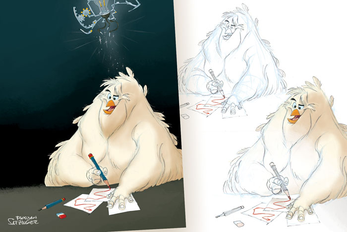
 'Birds And Pencils And Sundry Other Things And Hobs' by Florian Satzinger (Brandstudio Press)


 You can email me at: hello[at]paperwalker[dot]com


 Photos © Ipplepen/S&H

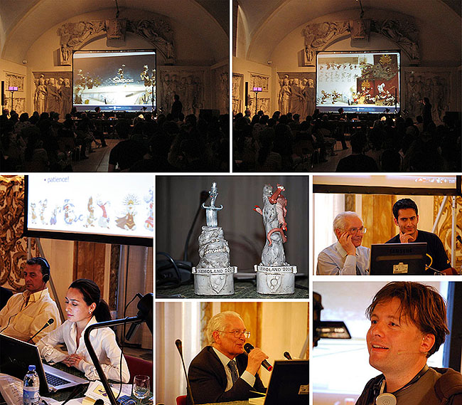 Photo impressions of the 2009 Nemoland festival (Photos © NEMO NT). From left to right: Stefano Casini, Maryam Laura Moazedi, Giuliano Cenci (2x), Alex Orrelle, Florian Satzinger.
 Alex Orrelle, Florian Satzinger, Florence 2009 (Photo © NEMO NT)


Florian, this is an amazing work!! Looking at those characters all together at the first option... you are a genious! I love to be your fan!!
ReplyDeleteThe web looks great, showing just one guy makes people courious to find more of them ;)
Less is more, very true but difficult to see it..
ReplyDeletegreat work
Amazing characters Florian. I really like the sense of design that you put in your drawings. I enjoy your blog very much!
ReplyDeleteSalud!!
excellent...
ReplyDeleteI have to say that your drawing are a huge inspiration for me. You´re the a fantastic character design, hope some day i can draw a little bit like you. If you have some time to stop bye my blog, i´m creating some characters for my portfolio, and i would love your opinion about them.
ReplyDeleteThanks anyway. And please, keep posting like a mad man!!
good luck and take care
Florian, everything you do helps to harmonize the universe some more! I like the idea of the character layout and it's really fun to look at. Then again, you wouldn't want to give all the characters away. I also agree, less is more.
ReplyDeleteBeautiful background too!
COOL!
ReplyDeleteYour designs honestly give me faith in humankind. By the way, are you using watercolours on your designs, or is it photoshop?
ReplyDeleteKeep up the amazing work.
Pit, Daniel, Nicolas, Olivier, Henrique, Richard, Eric, Tim, Ramez!!! Many, many thanks!
ReplyDeleteRamez, I use Photoshop, almost exclusively.
Fantastic characters and fantastic blog!:o)
ReplyDelete